UX/UI Case Study | A Redesign of Wodify
I’m a logical person at heart. I believe good design and interfaces don’t make you think. They simply exist and you don’t think twice about them. Knowing this, you’ll understand why I hate Wodify. An app I literally use everyday and still get confused over - 4 years and counting. The worst part is I know exactly what I’m looking for and still can’t find it. In an age where Google makes all the information available, Wodify holds my information hostage.
Well, I suppose I should begin with “What is Wodify?” Put simply, Wodify is an application used by the majority of Crossfit gyms to allow users to check in to classes, track their progress, record workouts, see daily leaderboards, and access billing information. For instance, if you are going to the gym you would more than likely reserve a spot in a class, check-in upon arrival, record your results after the class, and troll the leaderboard at the end of the day (gym stalking).
I’ve been using this app essentially daily and just last week I could not figure out how to enter results because I forgot to check in to a class.
Getting frustrated while trying to show someone how to log a workout outside of a class, I decided I needed to do some research as to WHY this was so clunky and hard to use. So WHY is it so hard to use?
PROJECT ROLES AND GOALS
ROLE: UX research, UX design, UI design
GOAL: Discover why the app was hard for users to understand and redesign the app to be a seamless part of the workout experience (in or out of a class)
MY DESIGN PROCESS
Typically I use the Double Diamond Design process. However, I created a streamlined graphic to illustrate my steps. At the ground level of human centered design is empathy so let’s start there!
It is important to let your users give you the solutions rather than making assumptions beforehand. Let discovery reveal what your users want/need and design according to the parameters discovered. From here, define the needs, ideate, deliver prototypes (low or hi fidelity) and go back to your users for more. Then, test your prototypes and garner appropriate feedback in order to iterate to achieve your goals. Be empathetic in your designs while also being inclusive.
DISCOVER WITH EMPATHY
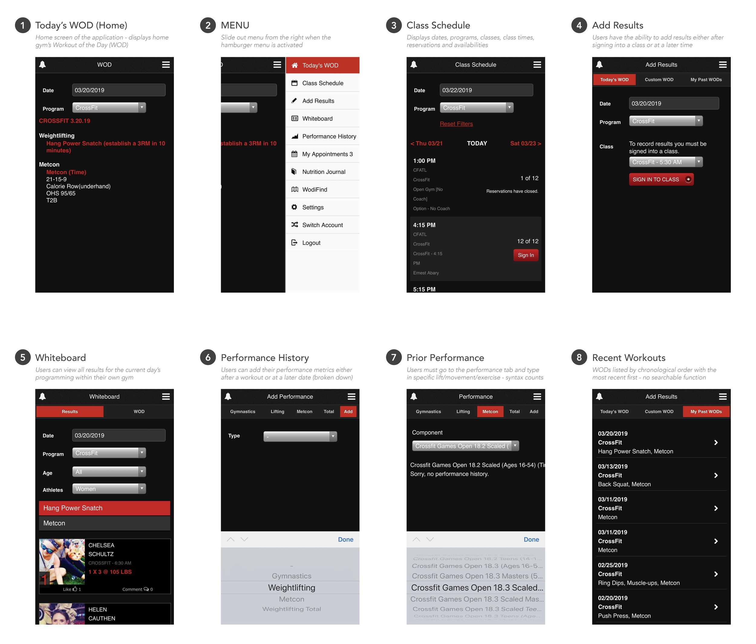
First and foremost, let’s take a look at the existing structure of the app (IOS version). I conducted an analysis of the current features to better understand the flow.
APP ANALYSIS
USER NEEDS
I conducted 22 in person interviews at my local Crossfit gym with users who have used the app at least three times per week for at least the past six months. The ages of the participants ranged from 18 to 52 years of age. Of the participants, 11 were male and 11 were female. 21 of the 22 people did not know the app even had a nutrition journal. 18 of the 22 participants had never entered any exercise information other than than class exercise totals.
“I only open the app to reserve a class and enter my results after class.”
All of the users indicated they have used the app to review their previous WOD scores/totals/times or prior weightlifting totals. Users were asked when and where they log their performance results. 20 of the 22 participants stated they logged their results immediately after the workout and before leaving the gym parking lot (some indicated they sat in their car to log the results). The two people who stated they did not log their results immediately after the workout also do additional programming and track it manually with pen and paper. Finding this interesting, I asked them why they did not log all the results in Wodify.
“Logging results in Wodify takes forever! Especially if you are doing anything outside of a class.”
Feedback such as this validates the need for a better user experience.
PERSONAS
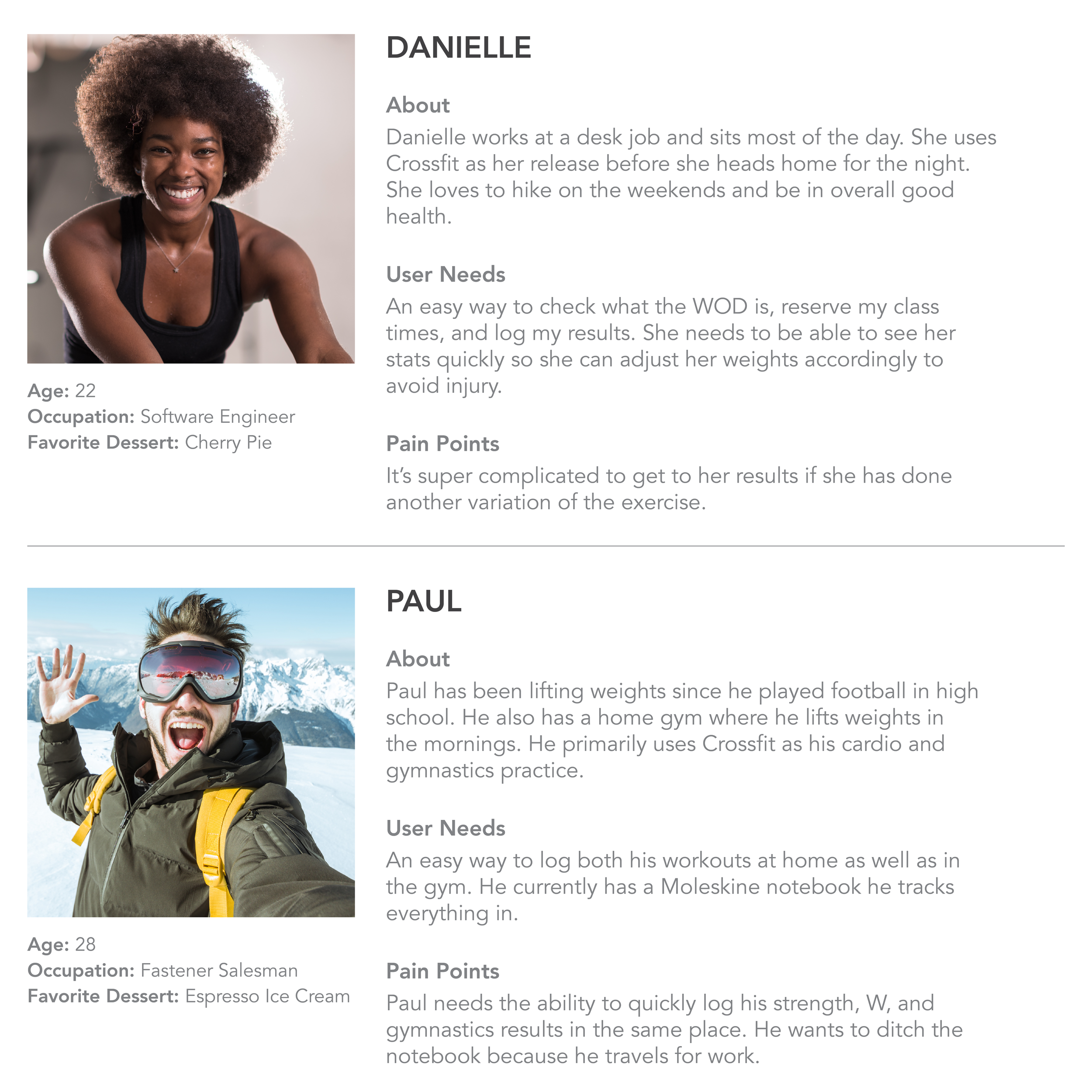
Personas are a great way to really get in touch with your users and define their needs. Below you will find two people with different needs to be met.
DEFINING THE PAIN POINTS
After my interviews, I narrowed my scope down to three major pain points in the app. These tasks are what my users vocalized having the most problems with while trying to enter or find information.
Where can I find my exercise results?
Streamline the menu to tasks users engage with the most.
Where and how do I add a workout or exercise I did on my own?
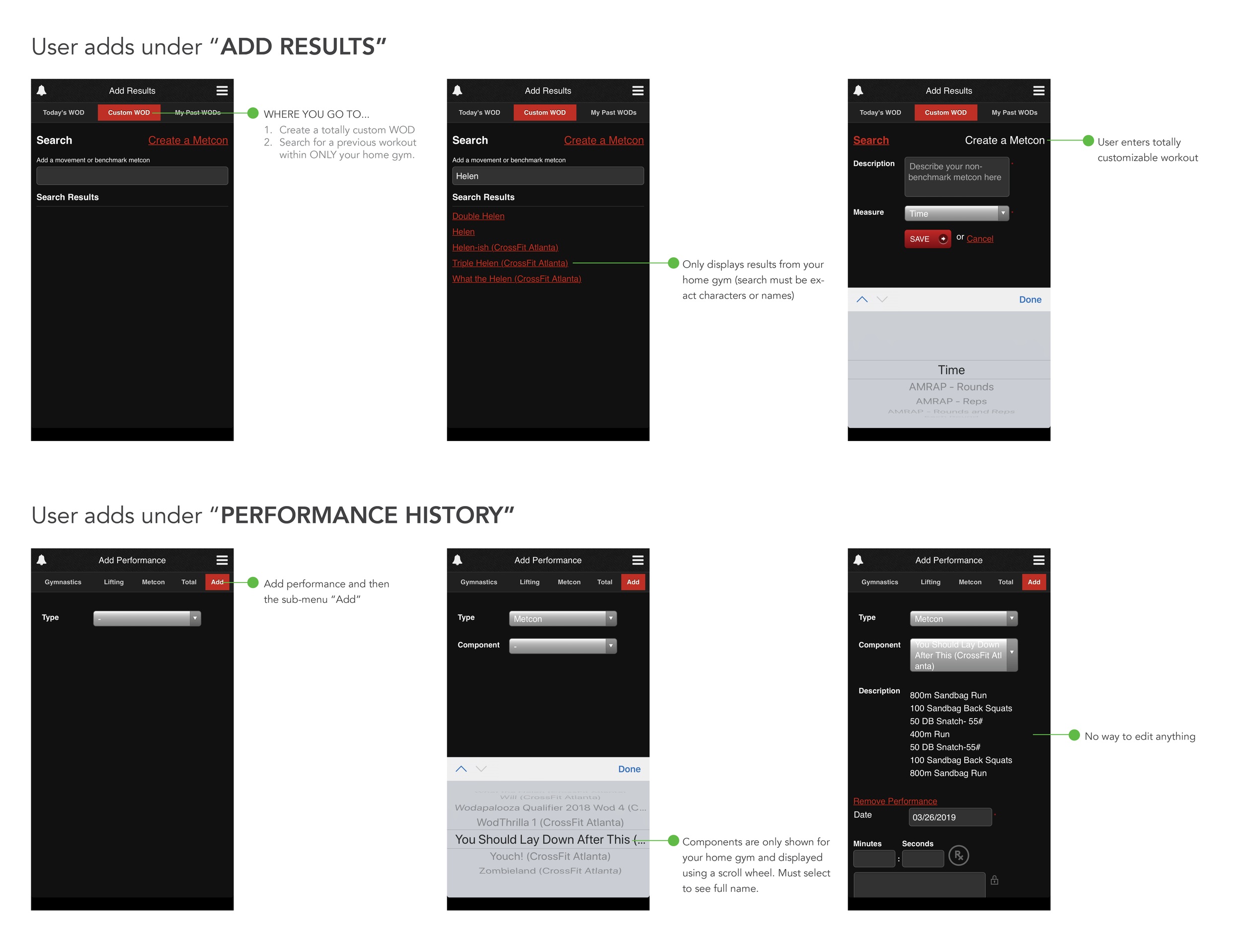
The app has multiple places to log information; however, depending on the type of movement, exercise, and whether it has been done before all factor into what menu and where it should be logged. For instance, if you are doing a workout your gym has done before and it was uniquely named (and you happen to know the name!), you would go to the menu and then "Custom WOD” to search. These results ONLY display WODs for your home gym. Otherwise you can “Create a Metcon.” Confused yet? Probably. That’s why this needs a second look.
1. Where can I find my exercise results?
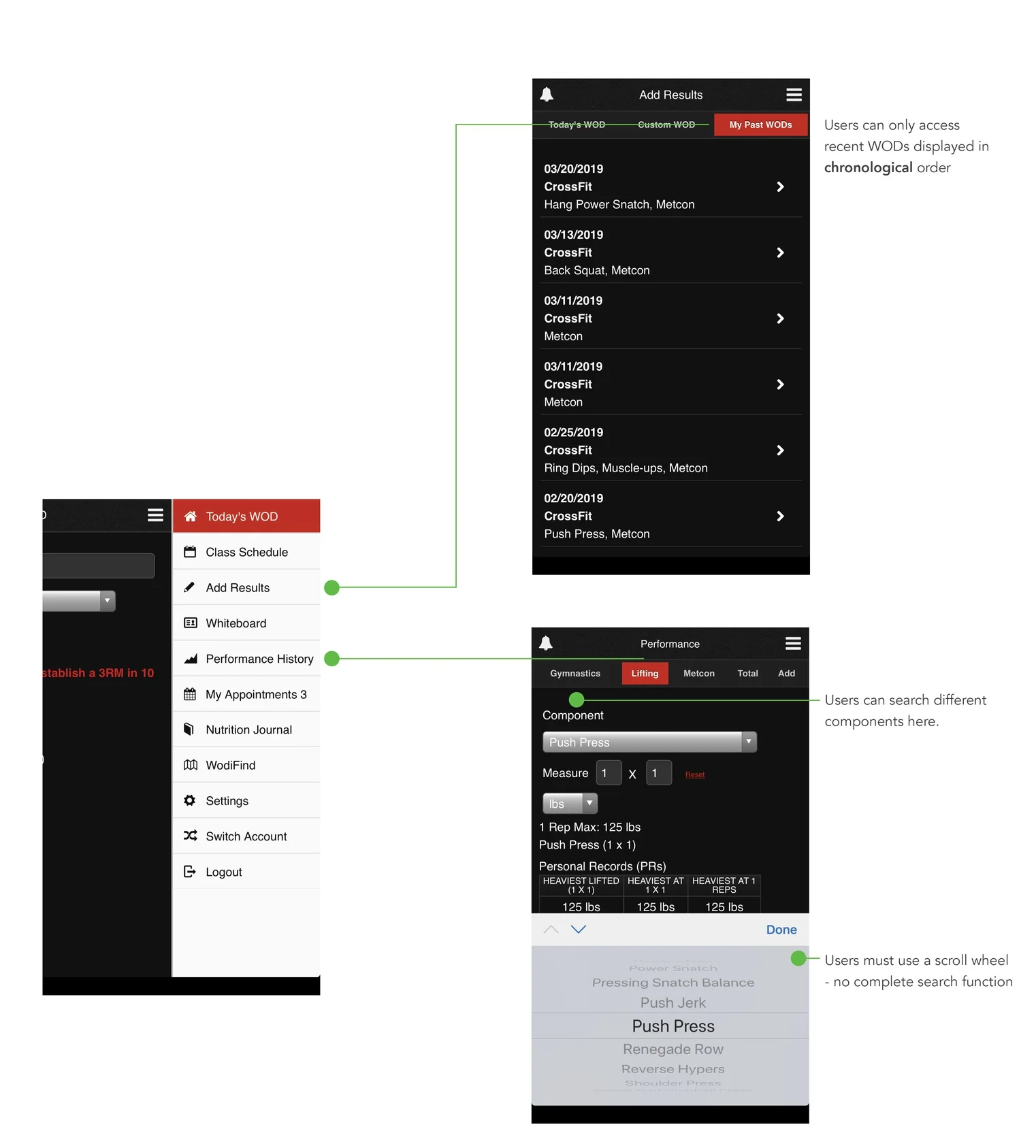
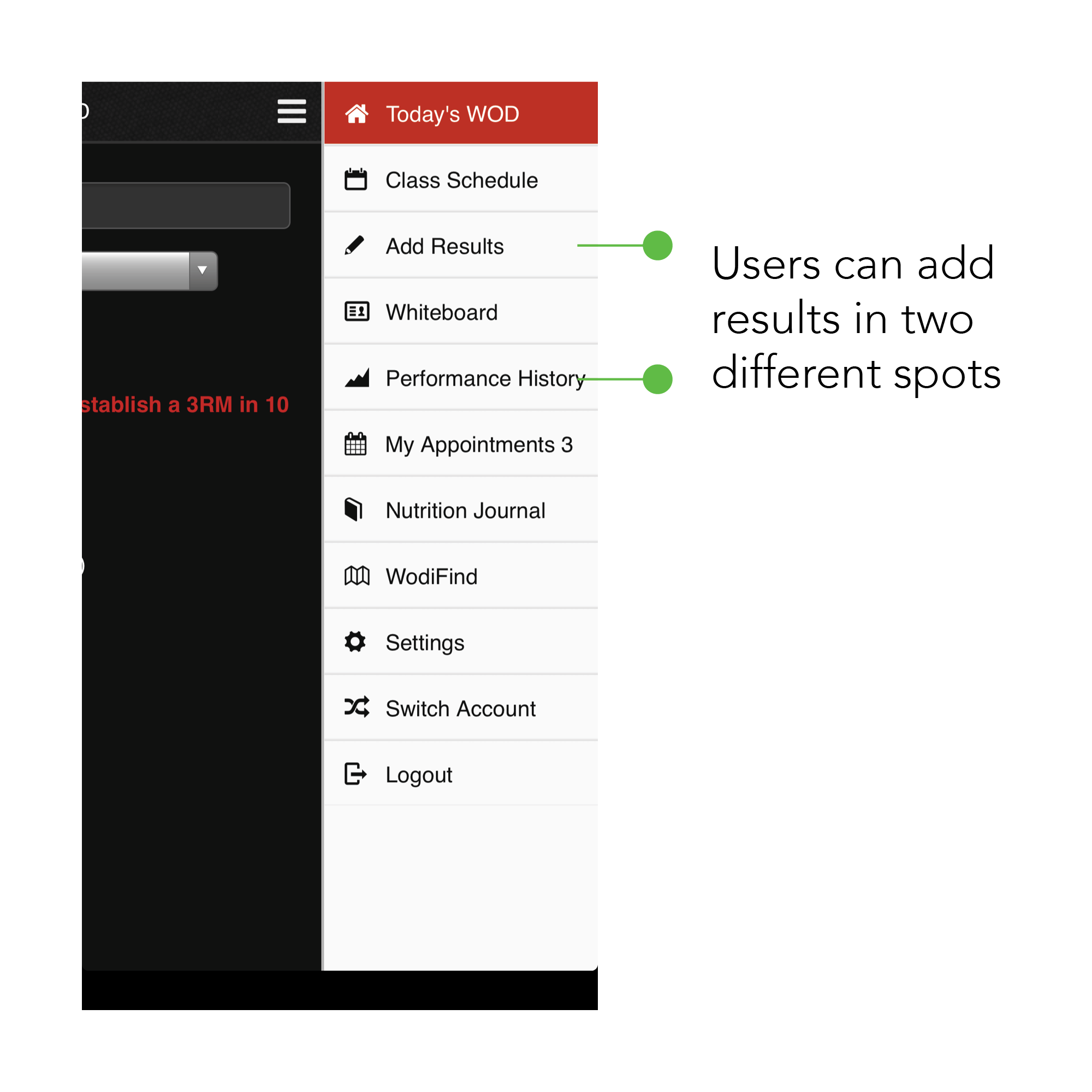
Two different places: Add Results & Performance History
Users had to click on multiple places to find the correct path when asked to enter either a weightlifting component or a Metcon.
2. Streamline the menu to tasks users engage with the most.
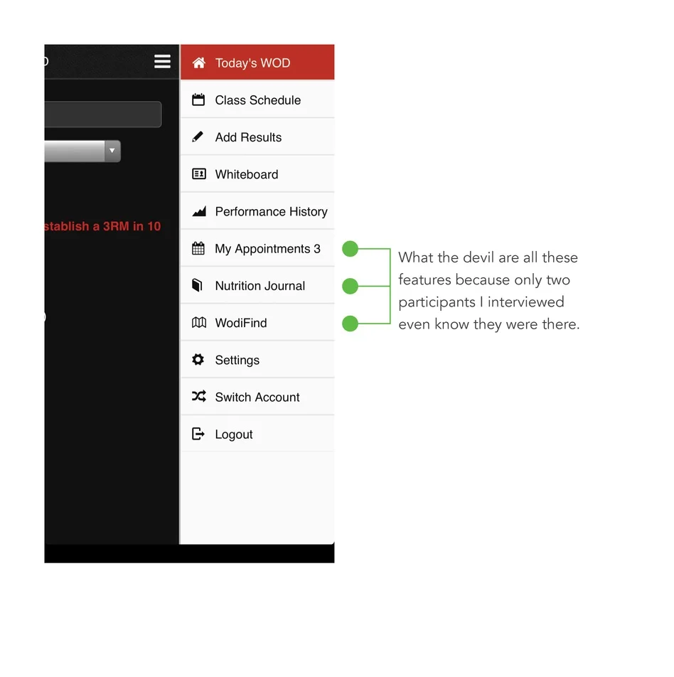
This menu obstructs the users view of the rest of the application while being convoluted in nature. There are excess features available the majority of people do not use.
3. Where and how do I add a workout or exercise I did on my own?
Depends on what you’re doing. You can only search workouts done (by name) in your home gym to add results, otherwise you can build the workout from the ground up.
The different menus give you different ways to log your information (in a v. confusing way). This is huge opportunity space. Users did not understand the difference in location and how it related to the type of information being entered.
IDEATION
Nearing completion of the first two phases, it was time to create parameters to ideate around. Taking into consideration the feedback and user insights, I decided to make a list of specific aims.
A more apparent menu on the home screen would serve as a way for users to navigate more easily
Results need to be located in a concise and searchable place
The fluff needs to go - get rid of the items users do not utilize
Make the app more intuitive
INFORMATION ARCHITECHTURE
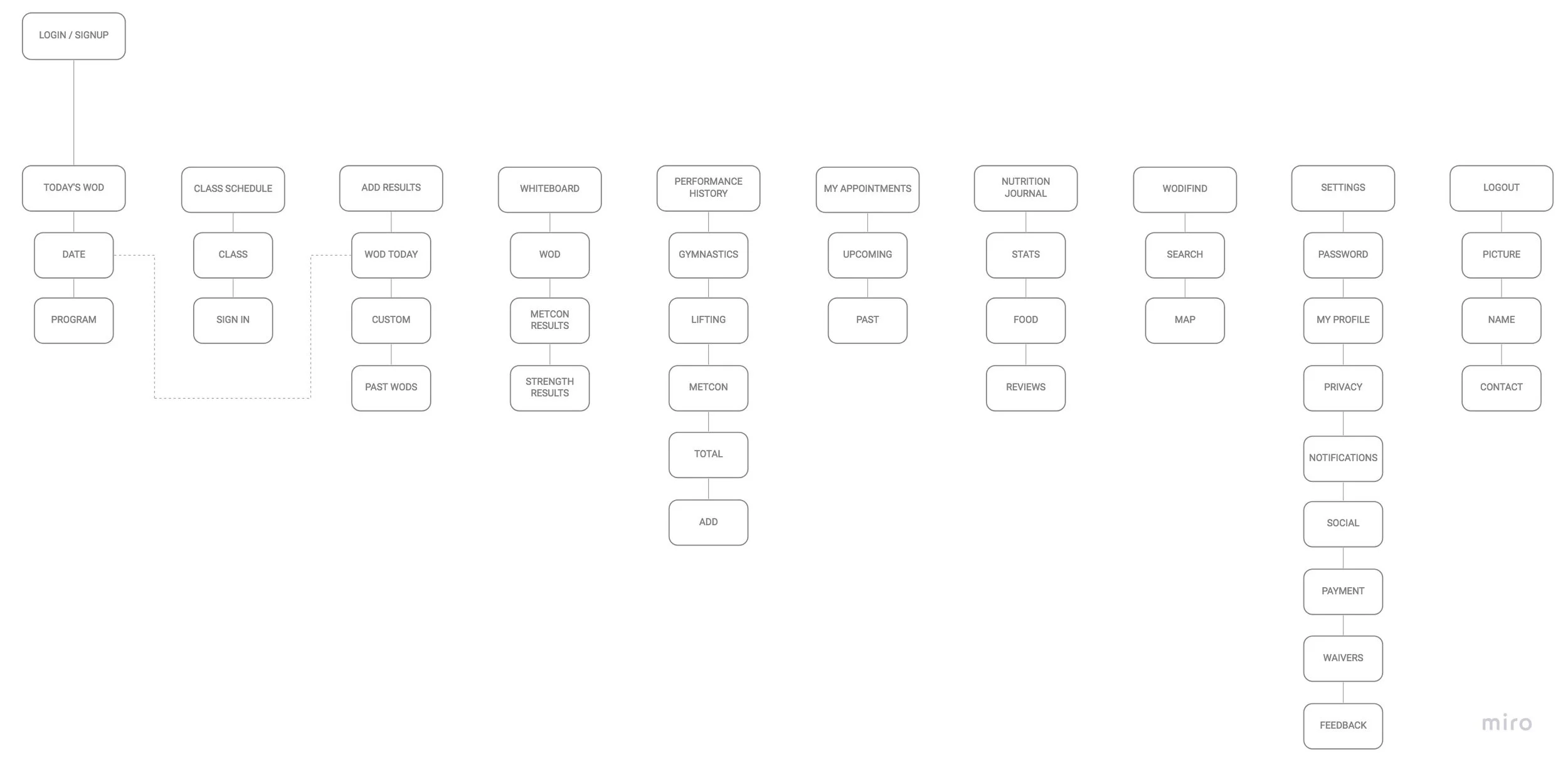
More apparent than anything else was the layout and flow of the app did not fundamentally make sense to most users. To really understand the layout the information architecture was distilled and mapped.
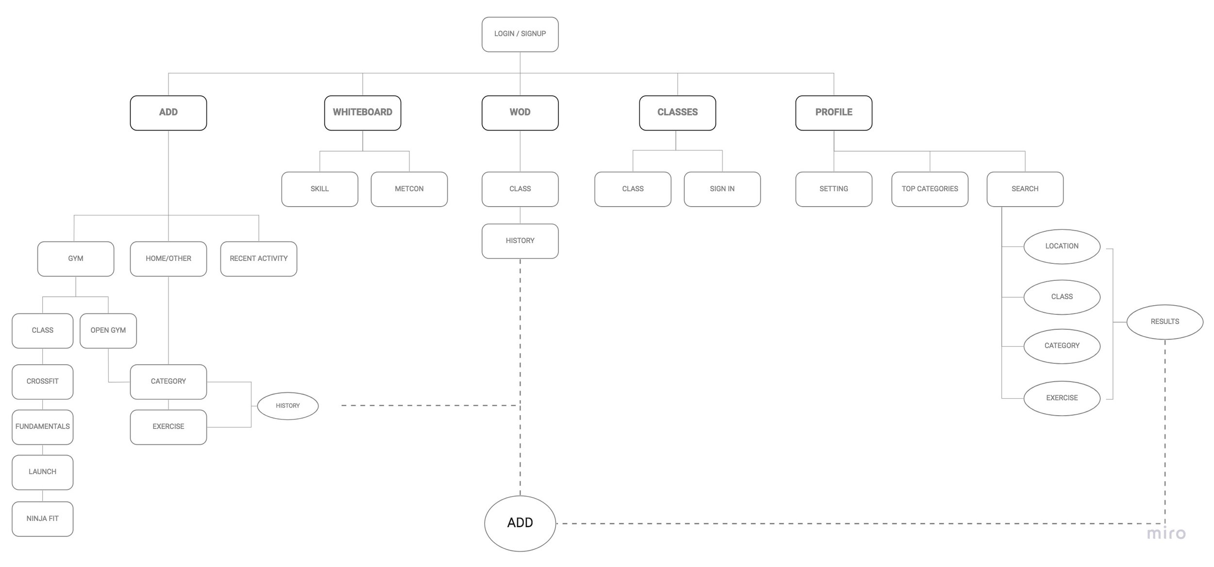
Current Information Architecture
Miro was utilized to create the information architecture. One can see the multitude of options available on the current architecture. A particular aim was to streamline the menu. Navigation was narrowed and only key features were included in the new architecture seen below. Multiple places will allow users to see the same information in a more meaningful way.
New Information Architecture
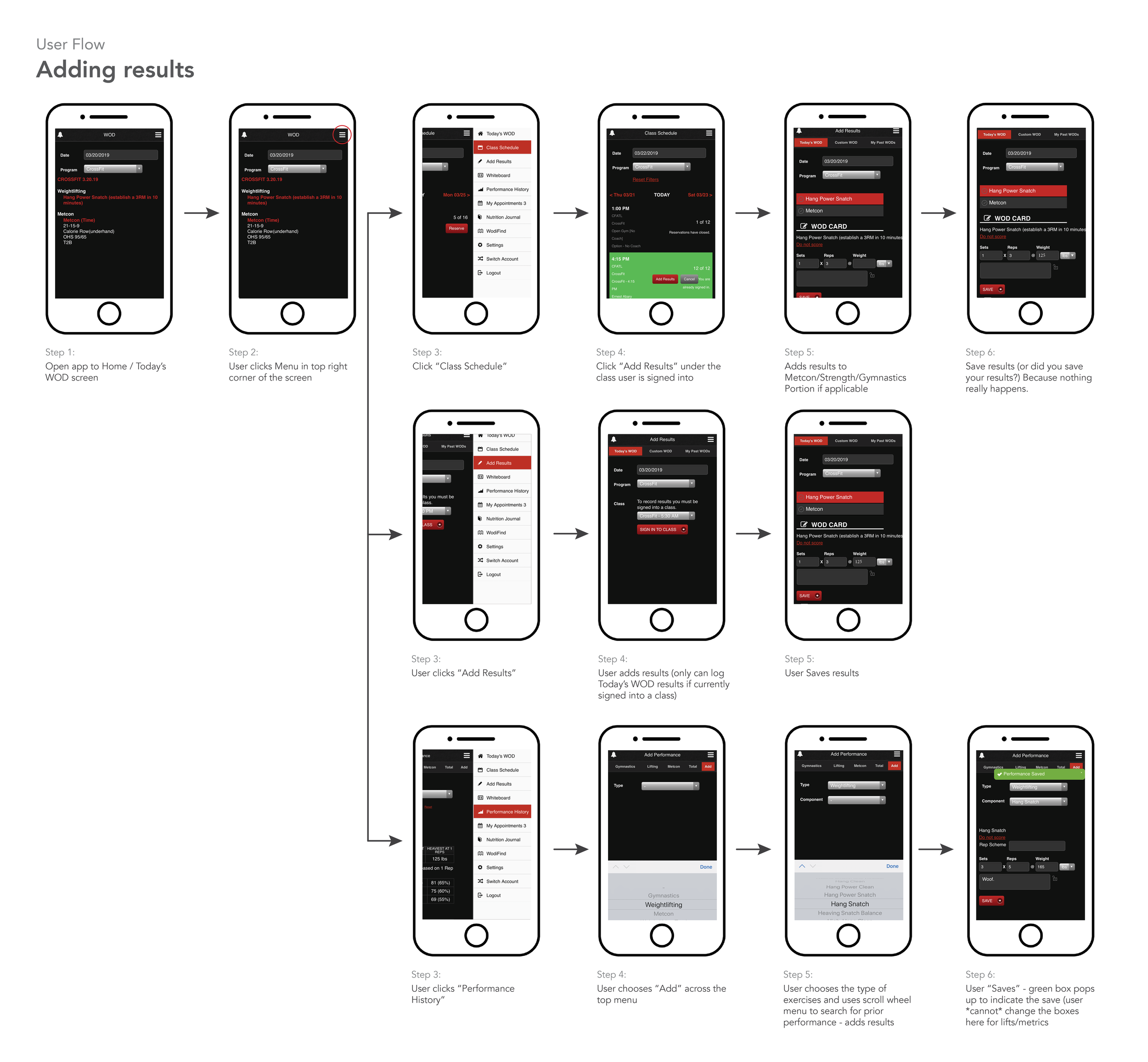
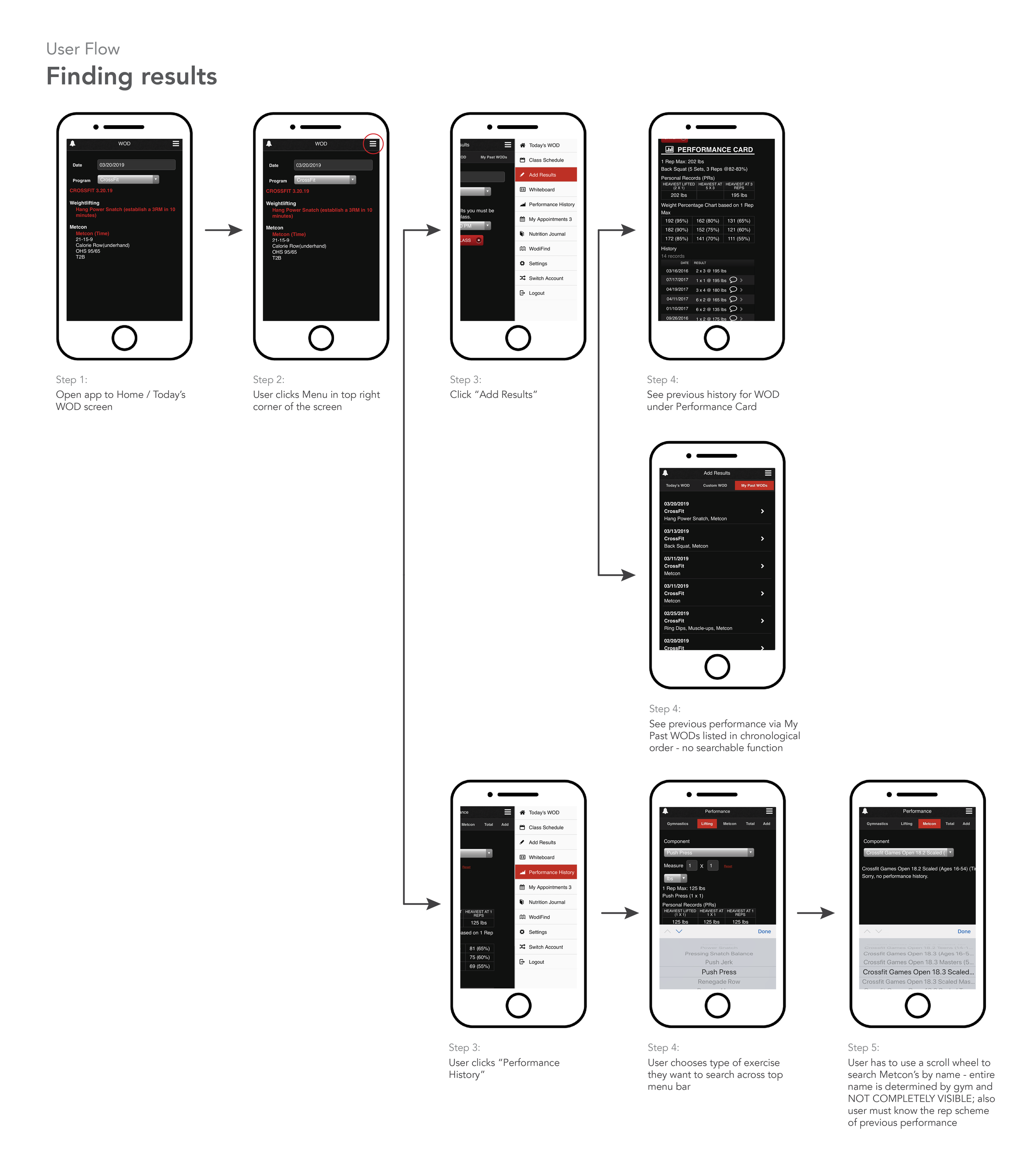
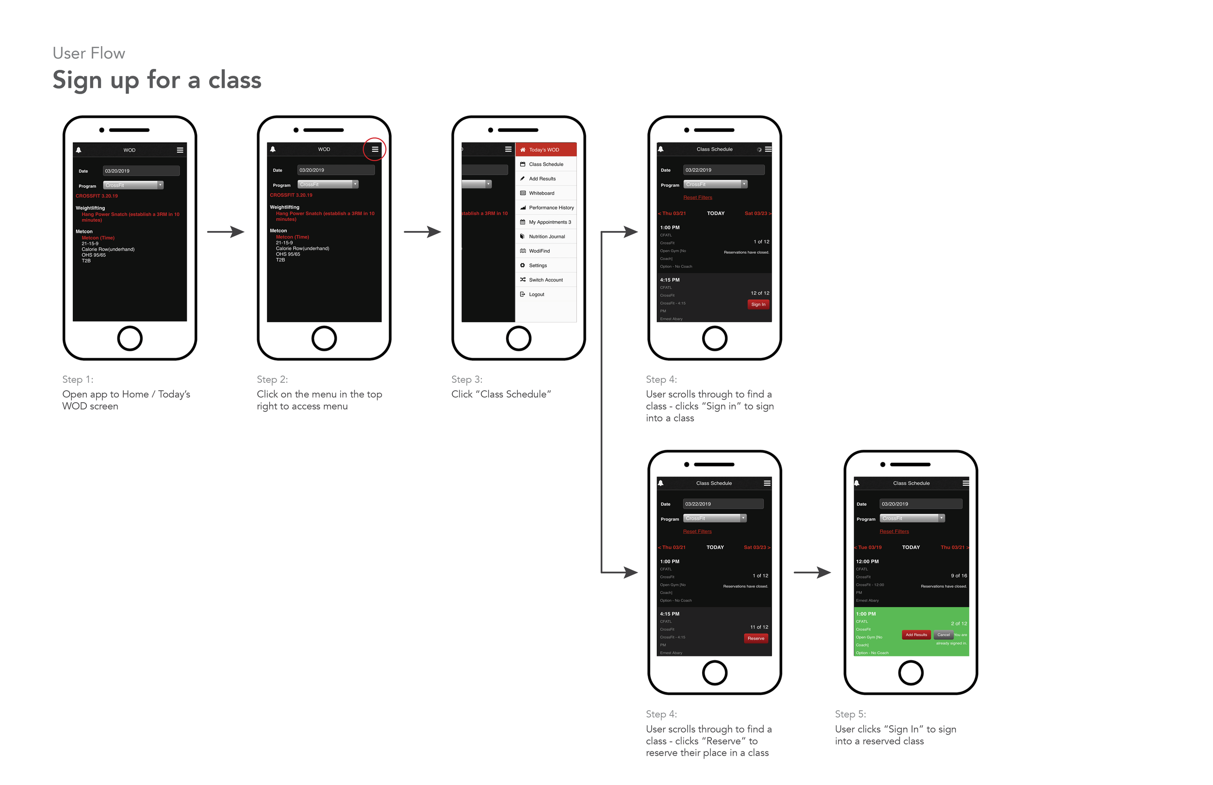
USER FLOWS (current)
I then mapped three key user flows to truly understand the information flow and opportunities. These three user flows are the main functions of the app. Understanding them by using multiple channels/research methods will allow me to design more intuitively. I believe user flows should be clear and flow in one direction as to show a linear progression as opposed to multiple channels going in a variety of directions.
PROTOTYPING (low fidelity)
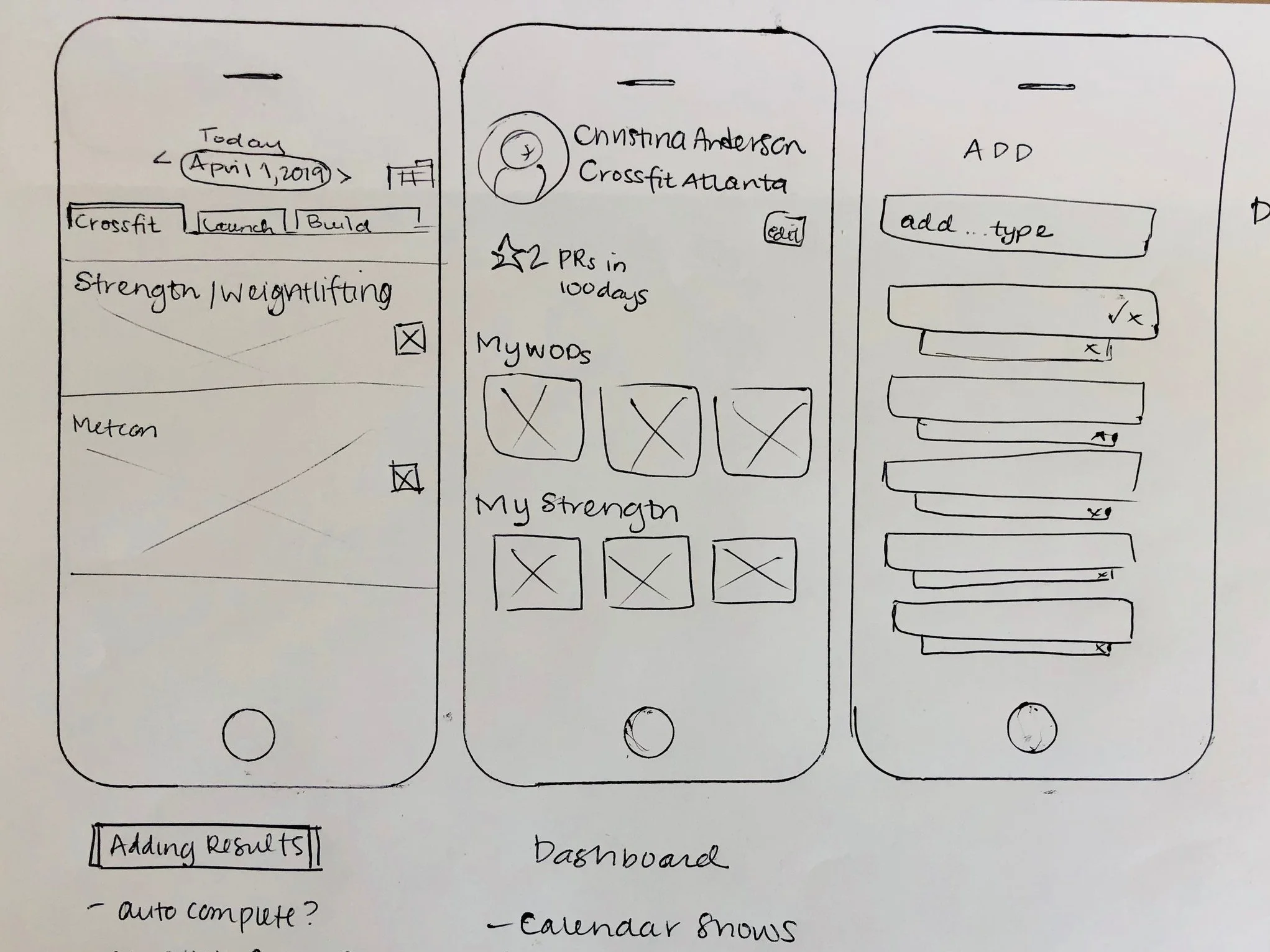
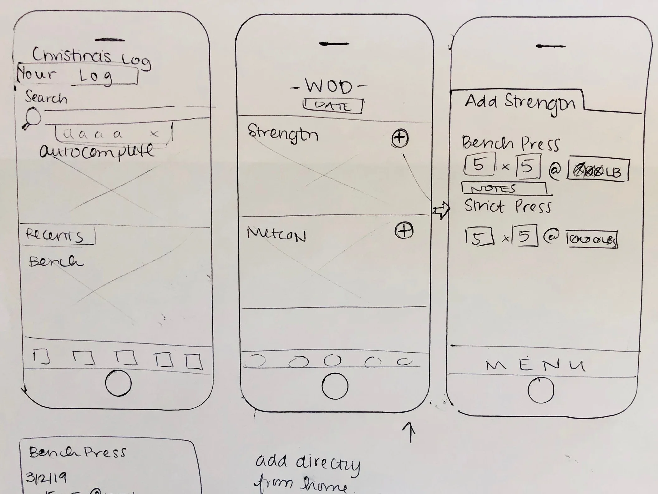
When prototyping, I always start with low fidelity. Sketches are quick and at this stage MORE IS BETTER - QUANTITY OVER QUALITY. It’s important to not limit yourself early on in the prototyping stage because something might work for users even though you don’t expect it to.
Participatory design is in my blood. As a former salesperson, knowing your client and getting feedback ALL along the way (really, constantly) is vital. Being able to pivot and quickly iterate with user feedback is where good design happens. Intuitive design.
To design well, the user should be able to take the path of least resistance to get to the product. Friction slows the user down so eliminating any friction is forward movement.
FEEDBACK
After sketching some of the flows, I took the sketches (no shame in this game) to my users for more feedback. It was important to them to have the least possible amount of interactions. Iterations were done on the spot and we made some great progress.
PROTOTYPING (medium-ish fidelity)
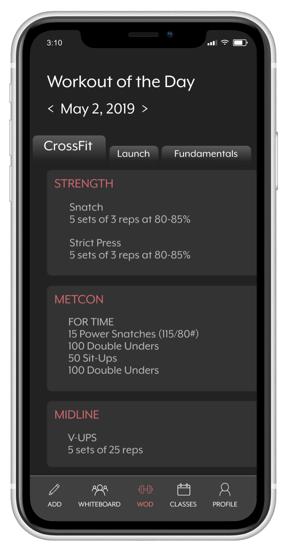
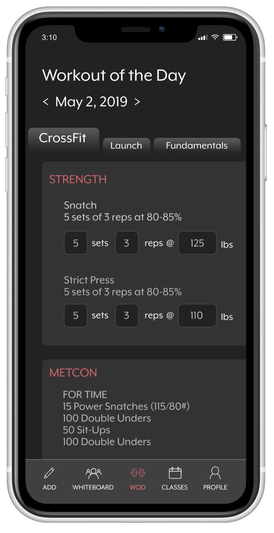
After the feedback and and mapping, I decided to move into InVision Studio to prototype some of the interaction. InVision is great because it’s a quick way to get a medium to higher fidelity prototype into the hands of your users. I made a few of the interactions and began to organize. The menu was an important new key feature in my redesign so I wanted that to be available. The current interactive prototype is here. As this is an ongoing project, the prototype will change and evolve.
GOING FORWARD
My plan going forward is to do multiple iterations and feedback cycles. The design, interactions, and flows should evolve. I believe a more transparent interface will allow users to quickly and easily enter their workouts regardless of where they choose to workout. Being able to keep track of goals allows the users to more accurately achieve them. Perhaps most importantly, a comprehensive search function will allow all the information to be in one place. I’m excited to see where this project leads and keep prototyping!

