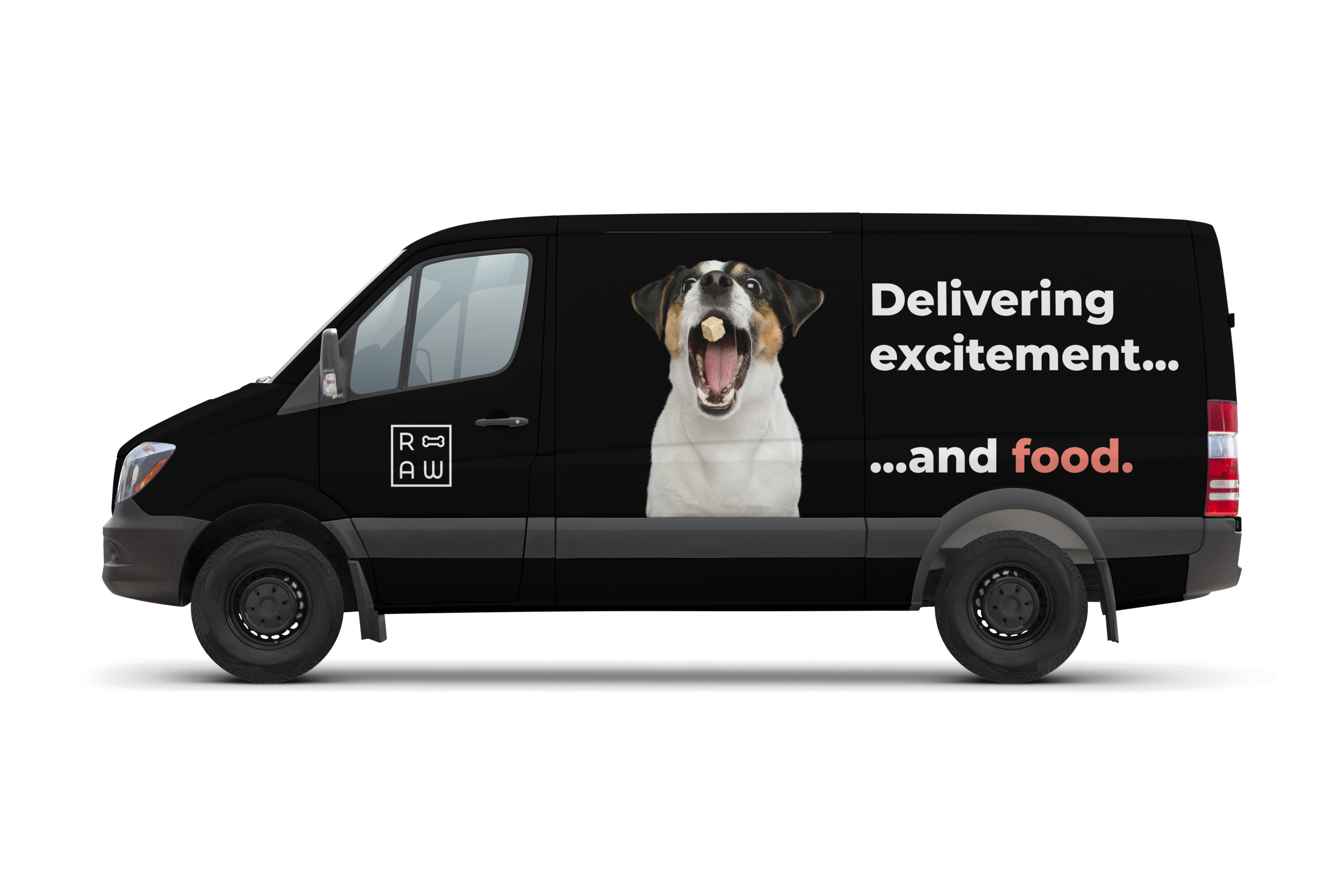
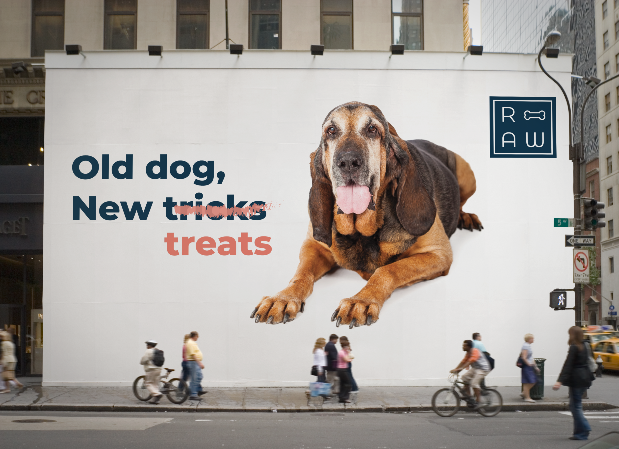
RAW | Research and Brand Identity Guidelines
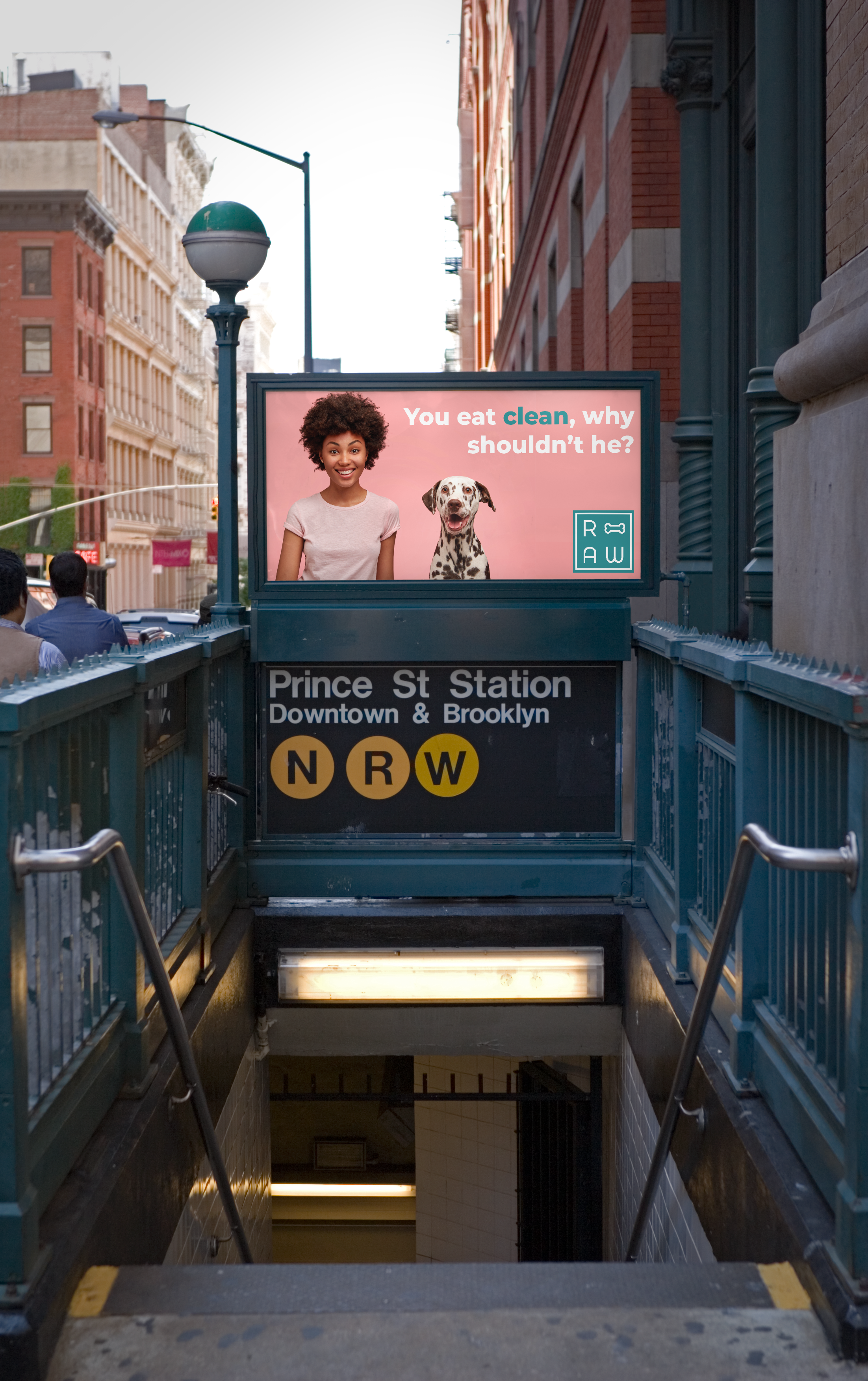
You eat clean, why shouldn’t your pet?
The pet food industry is saturated with brands. I explored the market to identify an opportunity to brand differently. Inspired by transparent and clean ingredient brands, RAW was created to bridge the gap in the market. If you’ve ever seen a pet food display, it can be overwhelming and stressful. What age is your pet? Is he allergic to anything? Does he have hairballs? Are his teeth clean? Is he gluten free? I don’t know about you but now I’m exhausted. I need a latte.
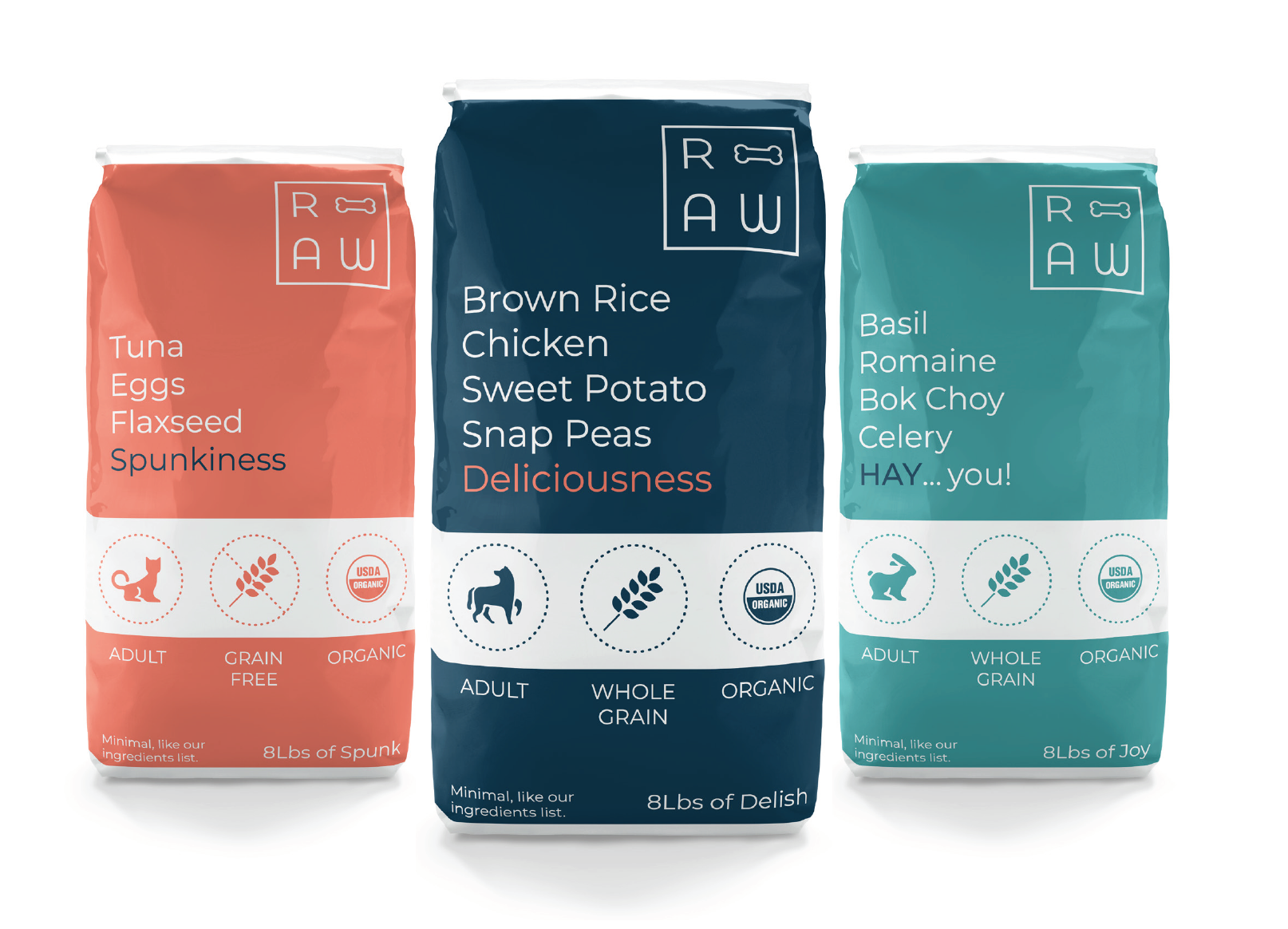
RAW let’s you know the ingredients right on the package with a cheeky twist. Their simply ingredients are listed up font for all to see. Because when you’re buying pet food, isn’t that the most important thing anyways? Plus, a laugh never hurt anyone.
Below you will find the visual identity guidelines for RAW. Designed to stand alone on behalf of the brand.
I used Adobe (Photoshop, Illustrator, InDesign), and LiveSurface Context to create.
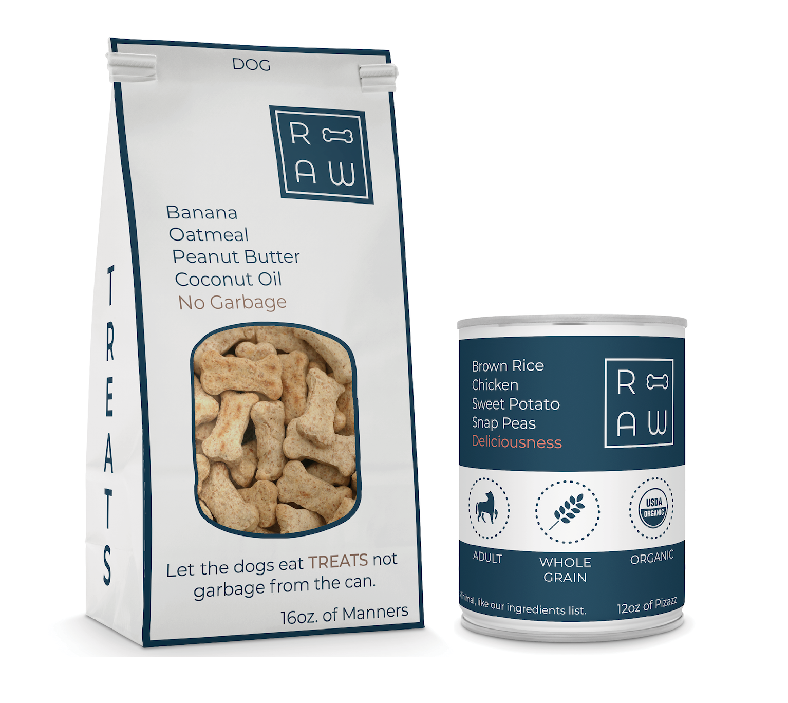
Treats for their tricks.
No garbage, BS, or junk.
Visual Identity Guidelines:


